

Tom Earnest Team
Brand Identity • Logo Design • Brand Guidelines
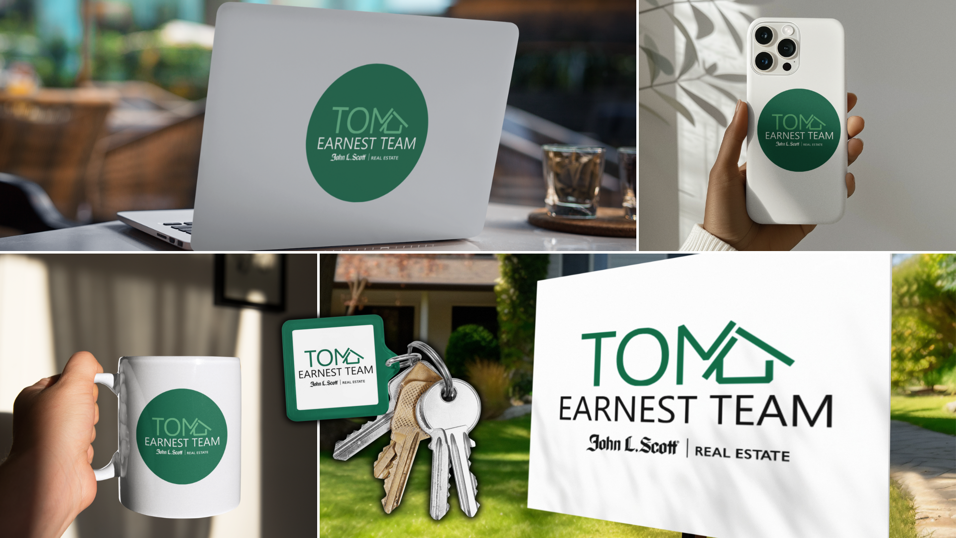
Overview
Tom Earnest is a Managing Broker at John L. Scott South Kitsap & Gig Harbor Regional Office with a strong presence in both real estate and his local community. He approached me to refresh his existing logo and create a more polished visual identity while staying aligned with John L. Scott’s established brand colors.
As an active broker with multiple listings and an extensive marketing presence—including more than 700 postcards and mailers sent to his client network—Tom needed a brand identity that felt professional, recognizable, and versatile across both print and digital marketing.
Tom was also highly collaborative throughout the process. His clear communication, openness to creative ideas, and consistent feedback made it possible to develop a refreshed identity that represented his business while complementing the John L. Scott brand.
Tom came to me looking for a complete refresh of the logo he had originally created in Canva. While he wanted to maintain the recognizable John L. Scott brand colors, he was ready for an identity that felt more polished, modern, and distinctive to his own business.
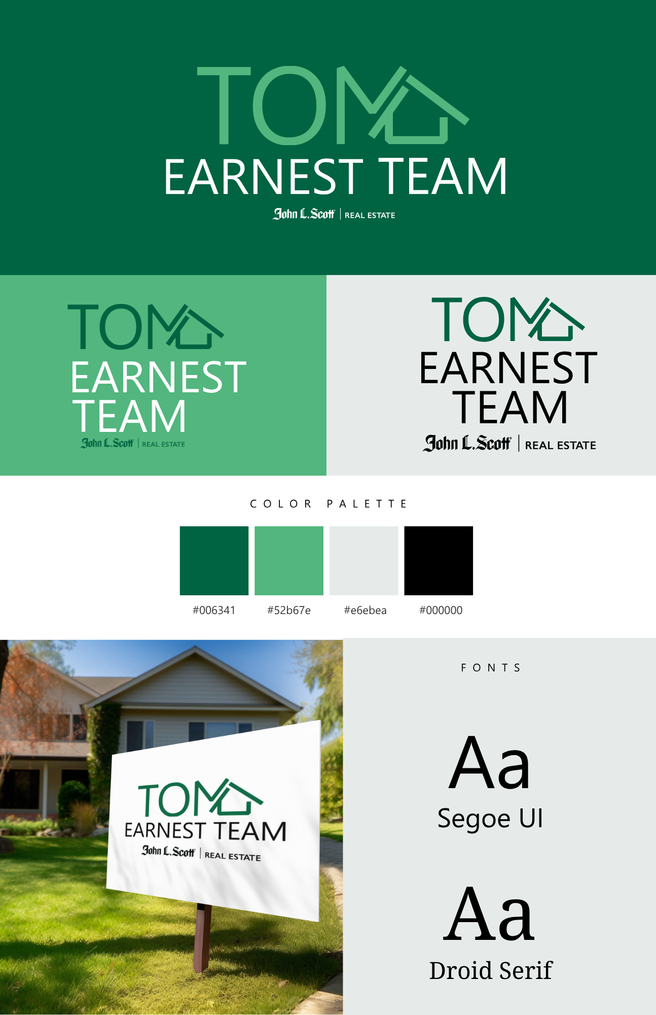
With creative freedom to explore a new direction, my challenge was to develop a one-of-a-kind logo that would stand on its own while still feeling connected to the John L. Scott brand. The final identity needed to be recognizable, versatile, and cohesive across Tom’s print and digital marketing.
The Challenge
My Role
Brand & Logo Designer
Logo Design
Visual Identity
Typography
Brand Guidelines
Marketing Applications
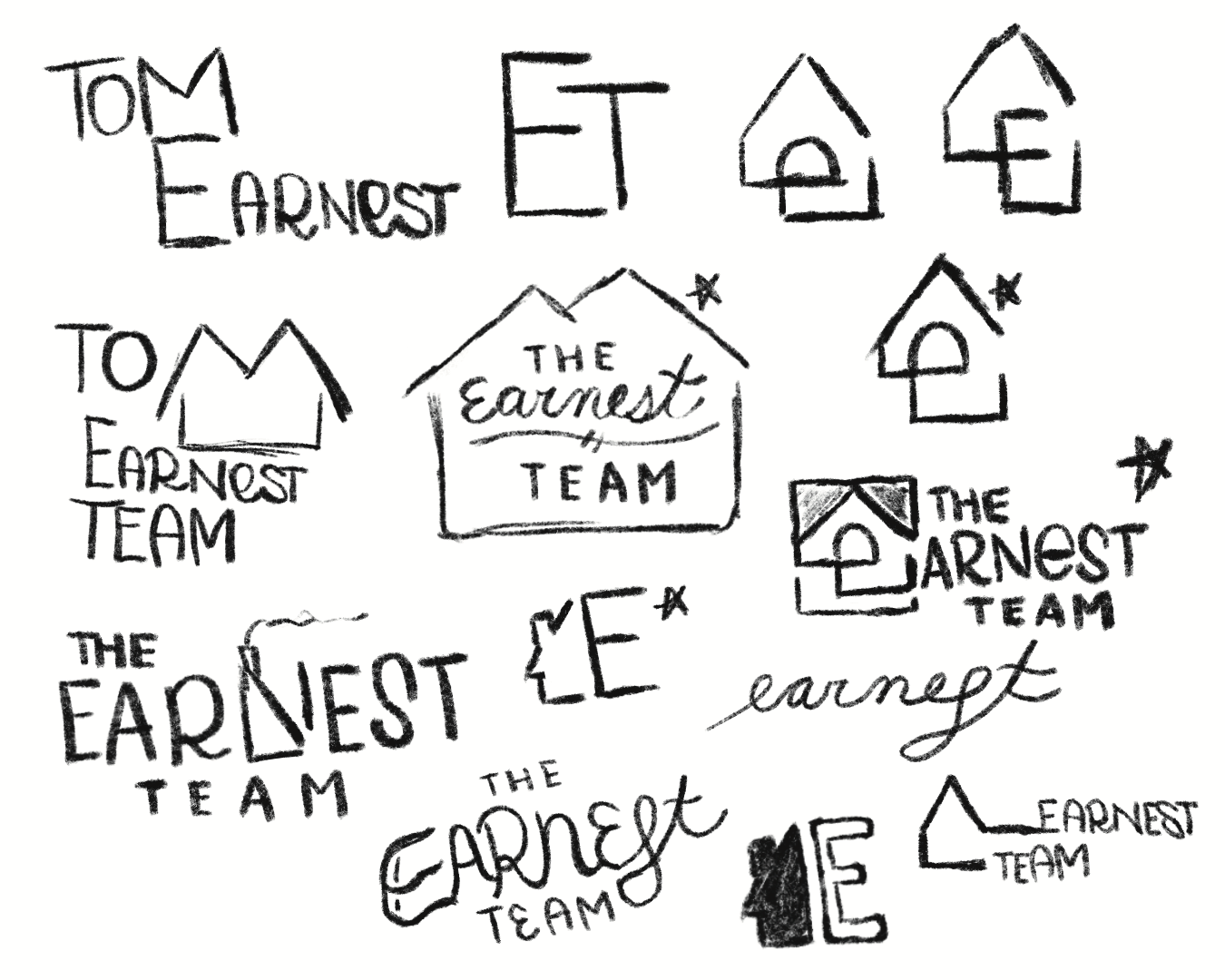
The Approach
Insert Description Here